Sprigs Floral Design
A brand to envelop life's biggest moments.
The Client
An award-winning florist who specializes in wedding and event florals with over 20 years of industry experience.
The Challenge
The need for a brand that is both timeless and relevant in a fast-paced, trend-focused industry.
The Strategy
Our strategy in emphasizing the 20+ years of industry experience is to set her apart instantly which will then reflect in a more professional aesthetic that isn’t focused on doing what may be “trendy” currently in the industry, but rather more stable, trustworthy, and established to endure the test of time.
The Design
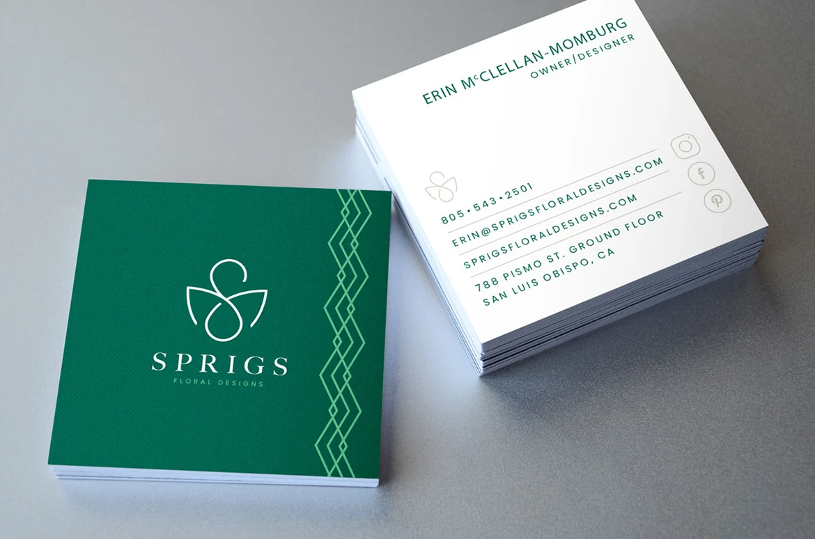
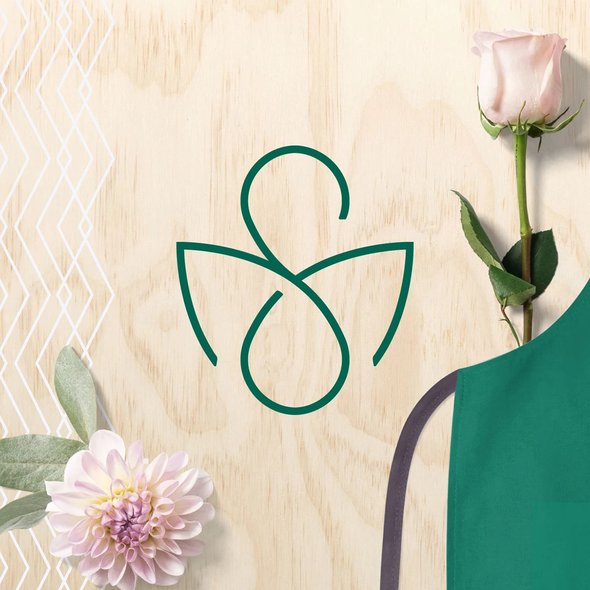
Keeping with a professional essence, the design is created from a monoline style to reflect the consistency and reliability of the service while portraying the “S” hidden within the botanical leaves. The design is mature, yet still sets a tone of fashion-forward to appeal to those who appreciate the quality craftsmanship that comes with years of experience.
The Creative Solution*
The brand maintains a balance of professionalism mixed with a more contemporary quality that doesn’t lessen the many years of experience and talent. By not allowing the brand to be too “trendy” we avoid it blending in, yet by expressing the business’s experience (not just history) we avoid it being an established yet dated brand. The fine line of balance empowers the business to stand apart while investing in a brand that will carry it further into the future for many years to come.
The Results
60% increase in leads, emails, and calls since rebrand. The new identity made the studio's experience, artistry, and event capability easier for customers to recognize before reaching out.
25% increase in website traffic since rebrand
Featured on DesignRush
The Shift
The identity made two decades of floral expertise visible, helping Sprigs feel established and current in a category often led by trends.
Explore the thinking behind our work.
What Improved
Years of expertise became visible.
The brand helped communicate professional floral experience in a category often led by trends.
The identity avoided short-lived style.
The monoline approach gave the florist a refined look that could age well.
The mark carried the moment.
The hidden S and envelope-like idea supported weddings, events, and life’s biggest occasions.
The brand felt reliable and artful.
The system balanced creative beauty with the confidence clients need for important events.
– Erin M., Owner